
Matplotlib Cheatsheet
Basic 2-Axis Plots
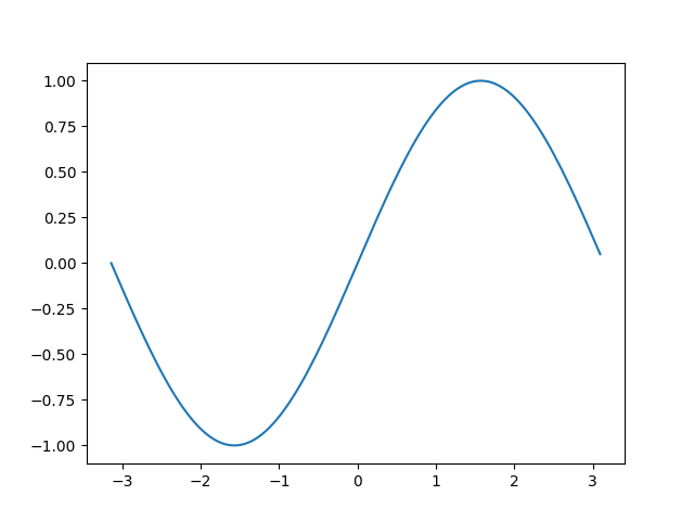
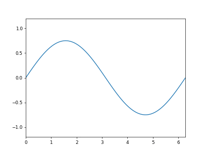
Simple Line Plot
import matplotlib.pyplot as plt
import numpy as np

t = np.arange(-np.pi, np.pi, np.pi/64.0)
x = np.sin(t)
plt.plot(t, x)
plt.show()
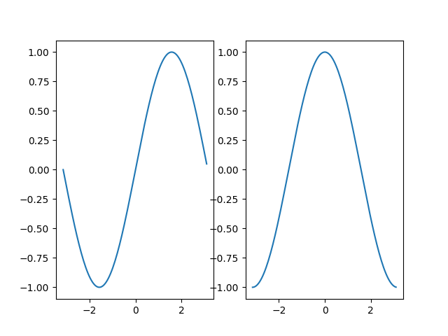
Subplot Horizontal
import matplotlib.pyplot as plt
import numpy as np

t = np.arange(-np.pi, np.pi, np.pi/64.0)
x = np.sin(t)
y = np.cos(t)

plt.subplot(1, 2, 1)
plt.plot(t, x)
plt.subplot(1, 2, 2)
plt.plot(t, y)

plt.show()
Subplot Vertical
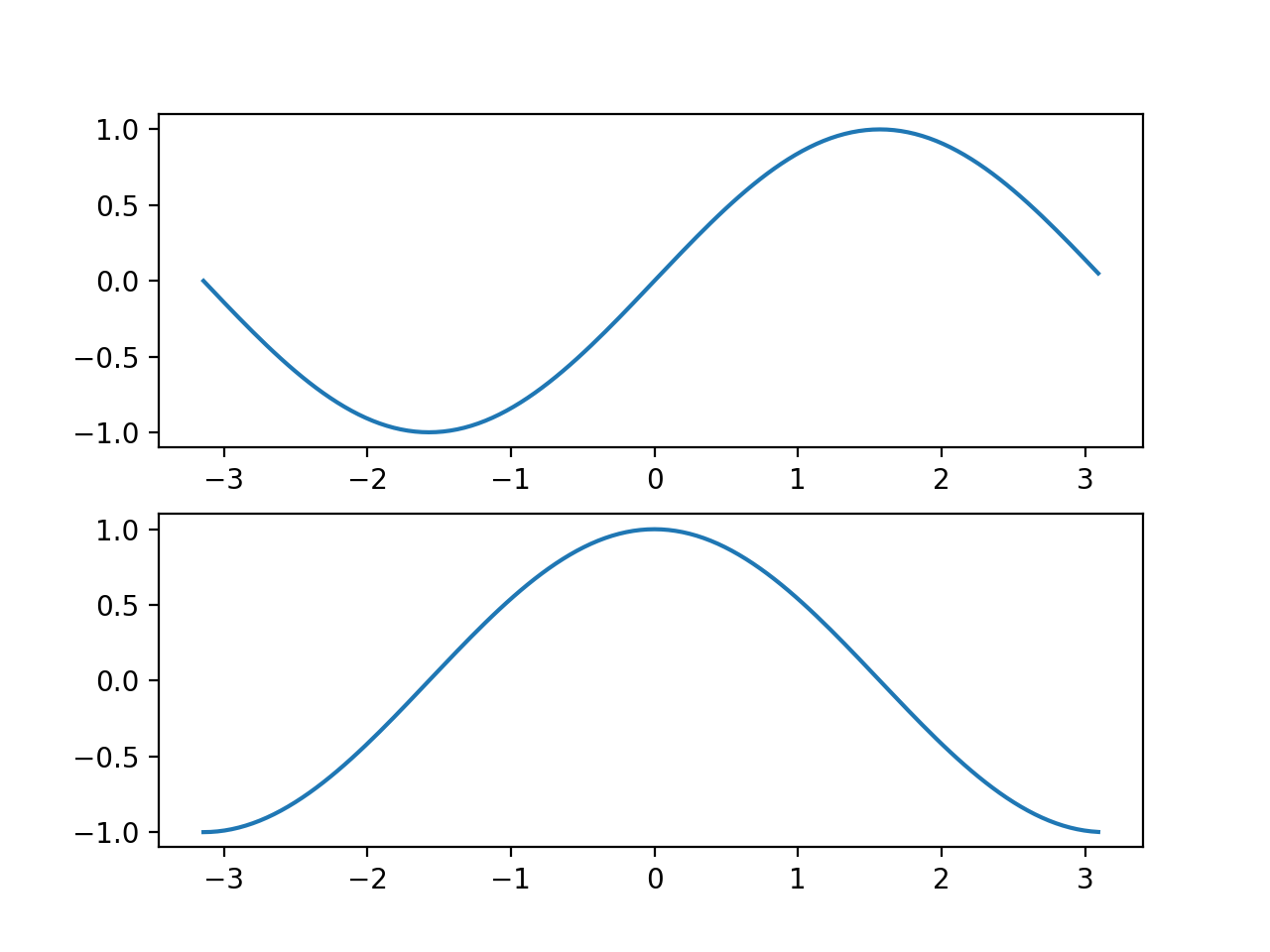
import matplotlib.pyplot as plt
import numpy as np

t = np.arange(-np.pi, np.pi, np.pi/64.0)
x = np.sin(t)
y = np.cos(t)

plt.subplot(2, 1, 1)
plt.plot(t, x)
plt.subplot(2, 1, 2)
plt.plot(t, y)

plt.show()
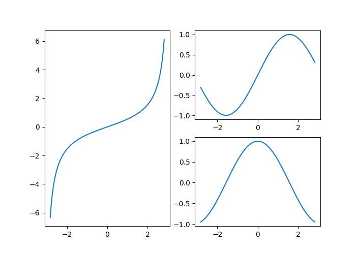
Subplot Gridspec
from matplotlib.gridspec import GridSpec
import matplotlib.pyplot as plt
import numpy as np

t = np.arange(-np.pi*0.9, np.pi*0.9, np.pi/64.0)
x = np.sin(t)
y = np.cos(t)
z = np.tan(t/2.0)

fig = plt.figure(figsize=(7, 5))
gs = GridSpec(2, 2, figure=fig)

fig.add_subplot(gs[:, 0])
plt.plot(t, z)
fig.add_subplot(gs[0, 1])
plt.plot(t, x)
fig.add_subplot(gs[1, 1])
plt.plot(t, y)

plt.show()
Mutliple Figures
See the real python guide on matplotlib’s figure/axes/axis heirachy.
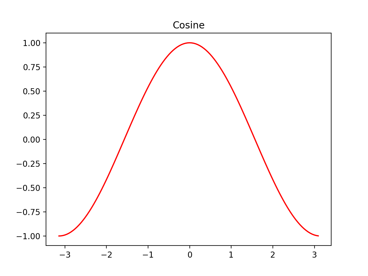
import matplotlib.pyplot as plt
import numpy as np

t = np.arange(-np.pi, np.pi, np.pi/64.0)
x = np.sin(t)
y = np.cos(t)

fig1 = plt.figure()
ax1 = fig1.add_subplot()
ax1.plot(t, x, 'g')
ax1.set_title("Sinusoid")

fig2 = plt.figure()
ax2 = fig2.add_subplot()
ax2.plot(t, y, 'r')
ax2.set_title("Cosine")

plt.tight_layout()
plt.show()
Bar Plots
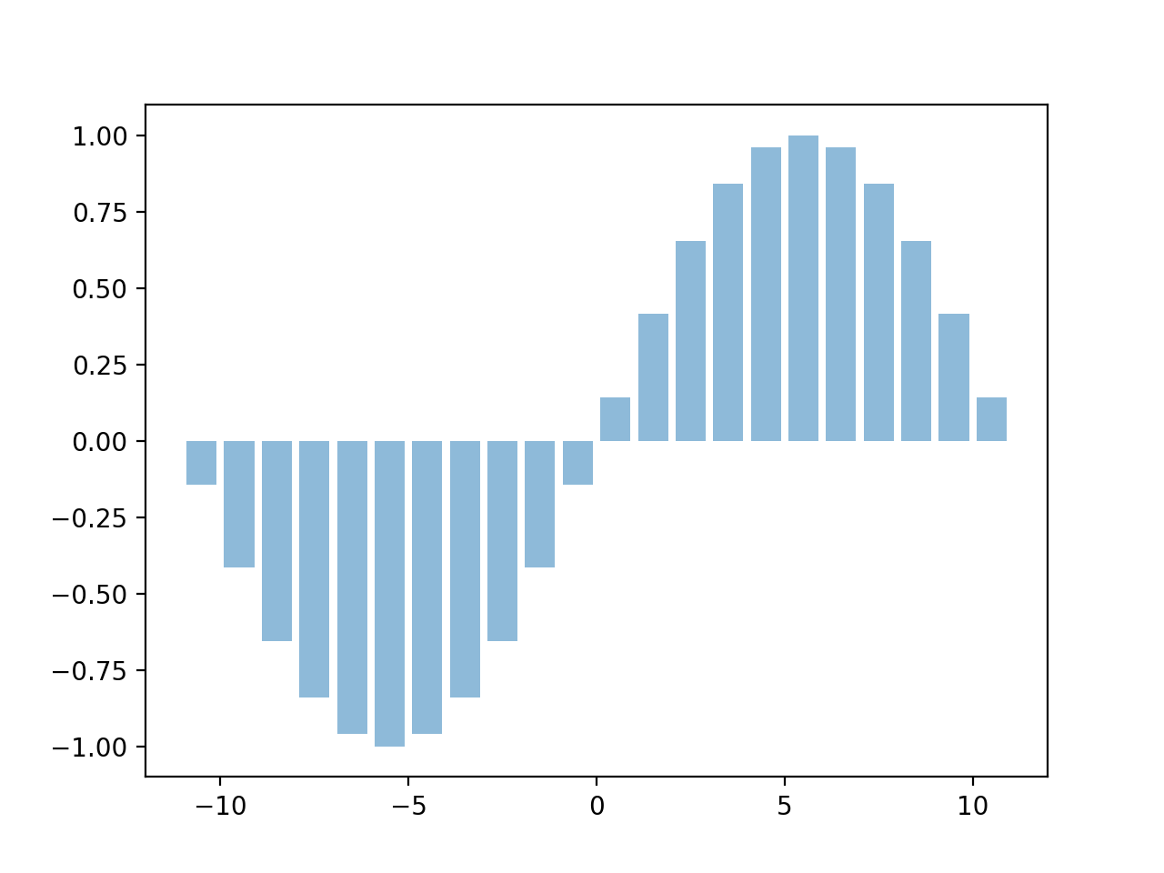
Simple Bar Plot
import matplotlib.pyplot as plt
import numpy as np

t = np.arange(-10.5, 11.5, 1.0)
x = np.sin(t * np.pi/11.0)

plt.bar(t, x, align='center', alpha=0.5)
plt.show()
Labelled Bar Plot
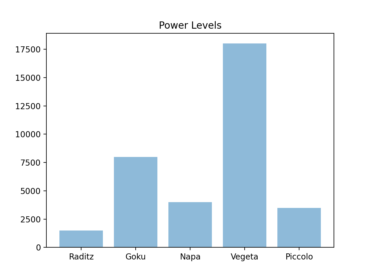
import matplotlib.pyplot as plt

labels = ["Raditz", "Goku", "Napa", "Vegeta", "Piccolo"]
values = [1500, 8000, 4000, 18000, 3500]

plt.bar(labels, values, align='center', alpha=0.5)
plt.title("Power Levels")
plt.show()
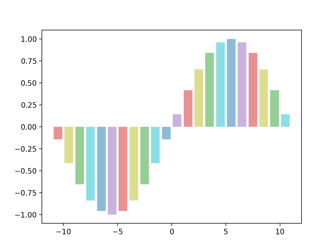
Colored Bar Plot
import matplotlib.pyplot as plt
import numpy as np

t = np.arange(-10.5, 11.5, 1.0)
x = np.sin(t * np.pi/11.0)
colors = ["tab:red", "tab:olive", "tab:green",
          "tab:cyan", "tab:blue", "tab:purple"]

plt.bar(t, x, align='center', alpha=0.5, color=colors)
plt.show()
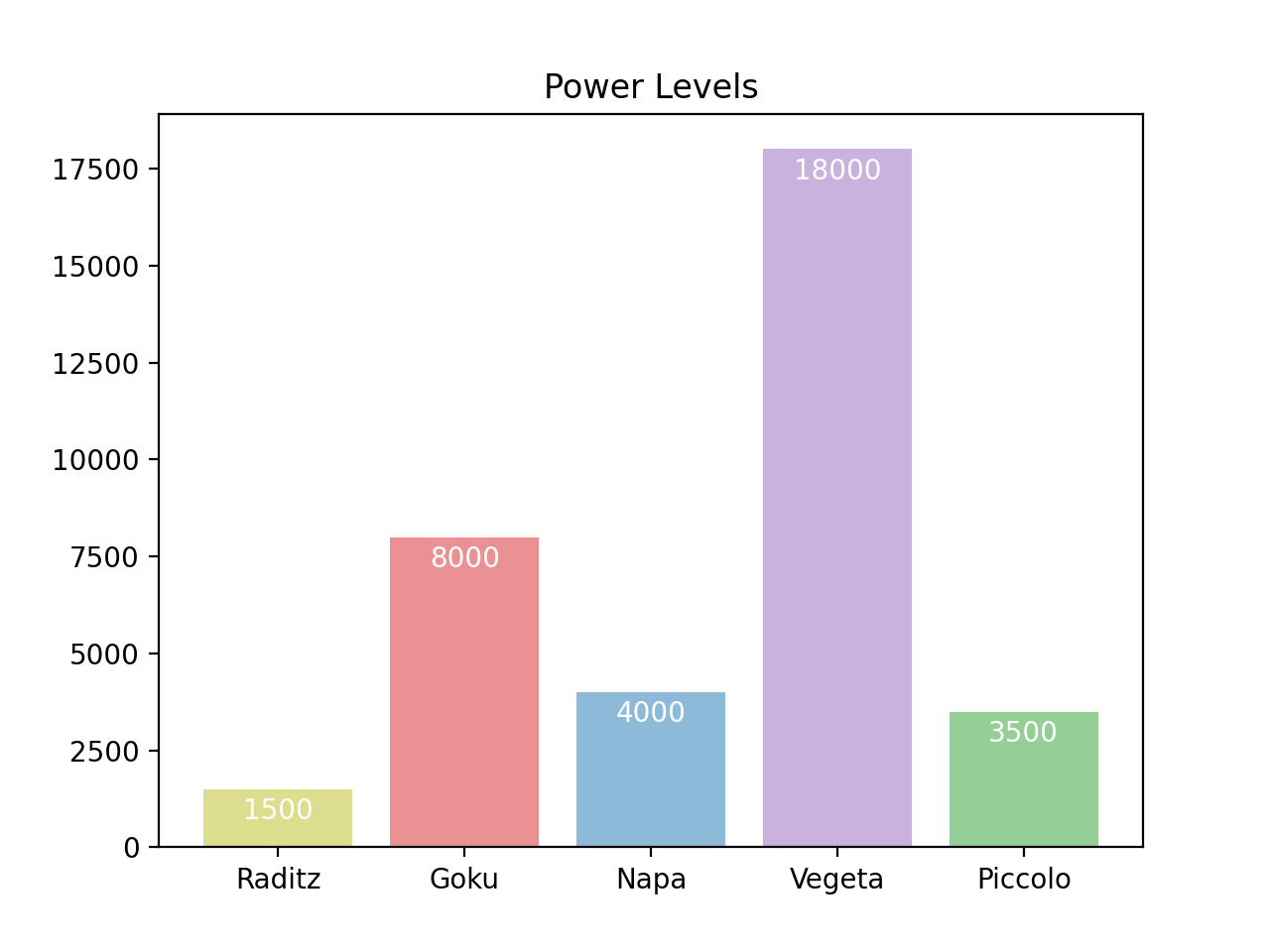
Labelled Bar Values
import matplotlib.pyplot as plt

labels = ["Raditz", "Goku", "Napa", "Vegeta", "Piccolo"]
values = [1500, 8000, 4000, 18000, 3500]
colors = ["tab:olive", "tab:red", "tab:blue", "tab:purple",
          "tab:green"]

fig = plt.figure()
ax = fig.add_subplot()
rects = ax.bar(labels, values, align='center', alpha=0.5,
               color=colors)
plt.title("Power Levels")

for rect in rects:
    y = rect.get_height()
    x = rect.get_x() + rect.get_width()/2.0
    ax.annotate('{:d}'.format(y), xy=(x, y),
                xytext=(0, -3), textcoords="offset points",
                ha='center', va='top', color='white')

plt.show()
3D Plots
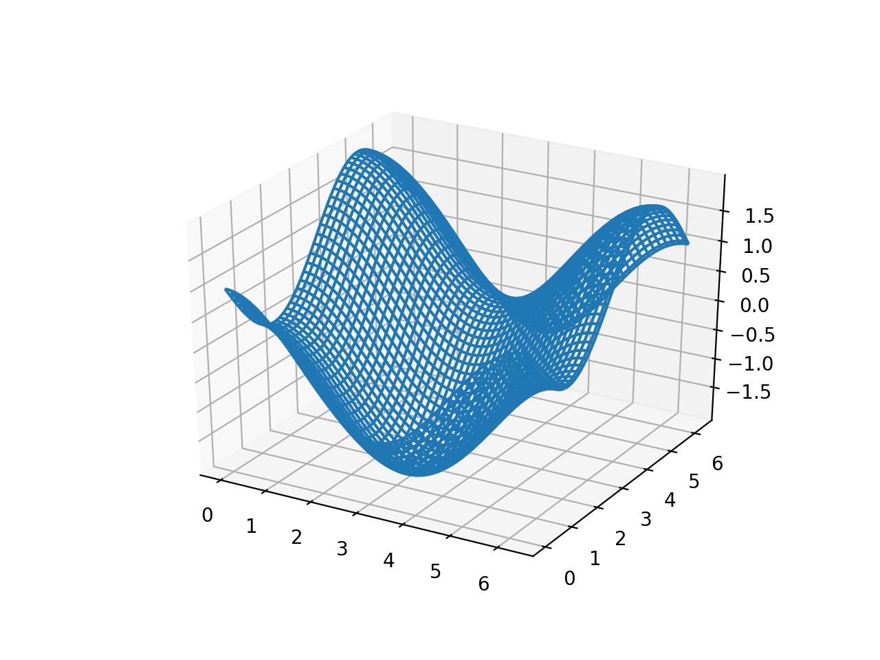
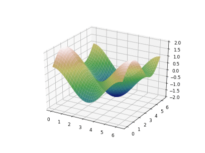
Simple Mesh
import matplotlib.pyplot as plt
import numpy as np

t = np.linspace(0, 2 * np.pi, 101)
x, y = np.meshgrid(t, t)
z = np.cos(x) - np.sin(y)

fig = plt.figure()
ax = fig.add_subplot(111, projection='3d')
ax.plot_wireframe(x, y, z)

plt.show()
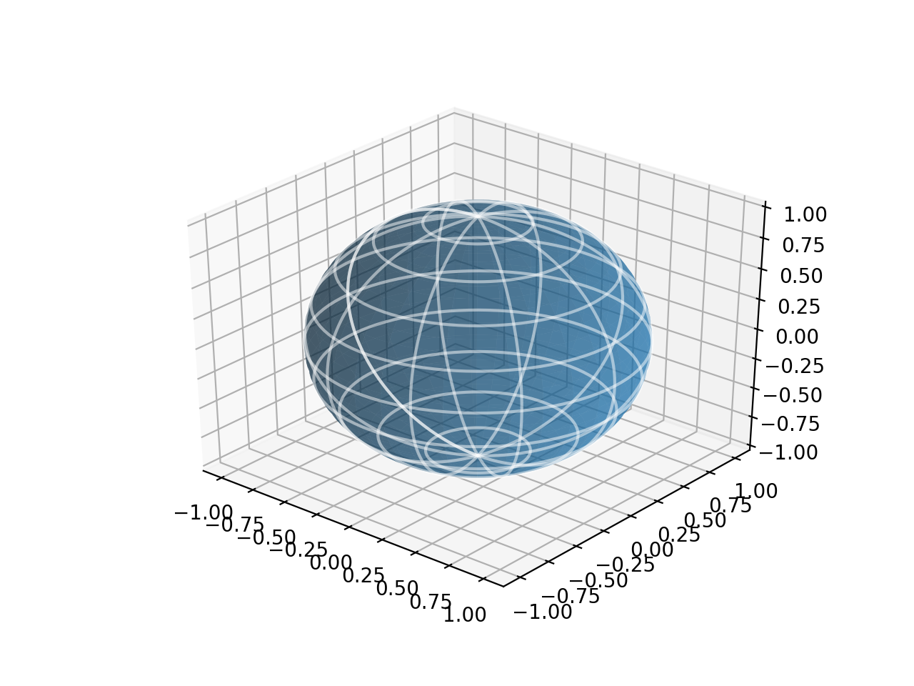
Simple Surface
import matplotlib.pyplot as plt
import numpy as np

SIZE = 101
u, v = np.meshgrid(np.linspace(-np.pi, np.pi, SIZE),
                   np.linspace(0, np.pi, SIZE))
x = np.cos(u)*np.sin(v)
y = np.sin(u)*np.sin(v)
z = np.cos(v)

fig = plt.figure()
ax = fig.add_subplot(111, projection='3d')
ax.plot_surface(x, y, z, alpha=0.5)
ax.plot_wireframe(x, y, z, color='w', rstride=10,
                  cstride=10, alpha=0.5)
plt.show()
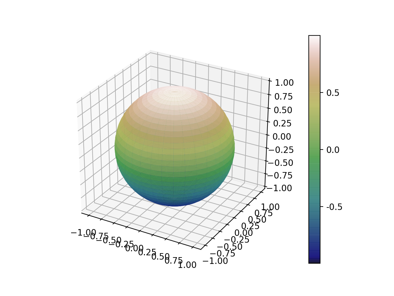
Colored 3D Plot
See Matplotlib colormaps for a list of avaliable colormaps.
import matplotlib.pyplot as plt
import numpy as np

SIZE = 101
u, v = np.meshgrid(np.linspace(-np.pi, np.pi, SIZE),
                   np.linspace(0, np.pi, SIZE))
x = np.cos(u)*np.sin(v)
y = np.sin(u)*np.sin(v)
z = np.cos(v)

fig = plt.figure()
ax = fig.add_subplot(111, projection='3d')
cax = ax.plot_surface(x, y, z, alpha=0.85, cmap="gist_earth")
cbar = fig.colorbar(cax, ticks=[-1, -0.5, 0, 0.5, 1])
cbar.ax.set_yticklabels(['', '-0.5', '0.0', '0.5', ''])
plt.show()
Animation
Simple Animation
import numpy as np
import matplotlib.pyplot as plt
import matplotlib.animation as animation

t = np.linspace(0, 2 * np.pi, 101)

fig = plt.figure()
ax = fig.subplots()
ax.set_xlim(np.min(t), np.max(t))
ax.set_ylim(-1.2, 1.2)

line, = ax.plot([], [])


def animate(i):
    line.set_data(t,
                  0.25 * np.sin(i*np.pi/250) * np.sin(6 * t + i * np.pi / 10) +
                  0.75 * np.cos(i*np.pi/250) * np.sin(t + i * np.pi / 125))
    return line,


ani = animation.FuncAnimation(
    fig, animate, interval=100, blit=True)

plt.show()
3D Animation
import numpy as np
import matplotlib.pyplot as plt
import matplotlib.animation as animation

t = np.linspace(0, 2 * np.pi, 101)

x, y = np.meshgrid(t, t)
z = np.cos(x) + np.sin(y)

fig = plt.figure()
ax = fig.add_subplot(111, projection='3d')


def animate(i):
    ax.cla()
    ax.plot_surface(x, y, z * np.cos(i * np.pi / 20),
        alpha=0.95, cmap="gist_earth", vmin=-2, vmax=2)
    ax.set_zlim([-2.0, 2.0])
    return ax,

ani = animation.FuncAnimation(fig, animate, interval=50)
plt.show()
Saving Plots
Saving a figure
plt.savefig("myplot.png")
or
fig.savefig("myplot.png")
Saving Animated Plots
- It sometimes helps to not have
blitset to true in the animator save_countdetermines the number of frames to save- Will need to install imagemagick (for gifs)
ani = animation.FuncAnimation(
    fig, animate, interval=50, save_count=40)
ani.save('myAnimation.gif', writer='imagemagick', dpi=64)
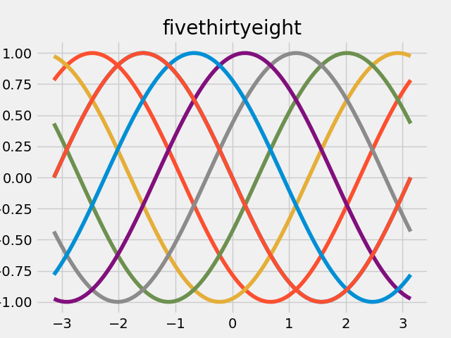
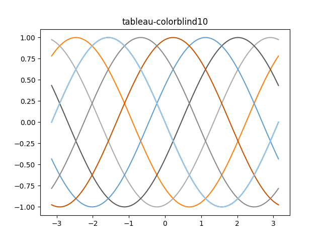
Style Sheets
See MatplotLib style sheet docs.
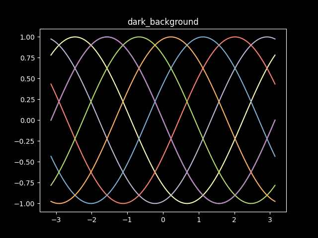
import matplotlib.pyplot as plt
import numpy as np

t = np.linspace(-np.pi, np.pi, 101)
theta = np.linspace(-np.pi, np.pi, 8)

x = np.array([t, ] * 8).transpose()
y = np.sin(x + np.array([theta, ] * 101))

with plt.style.context("dark_background"):
    plt.plot(x, y, '-')
    plt.show()
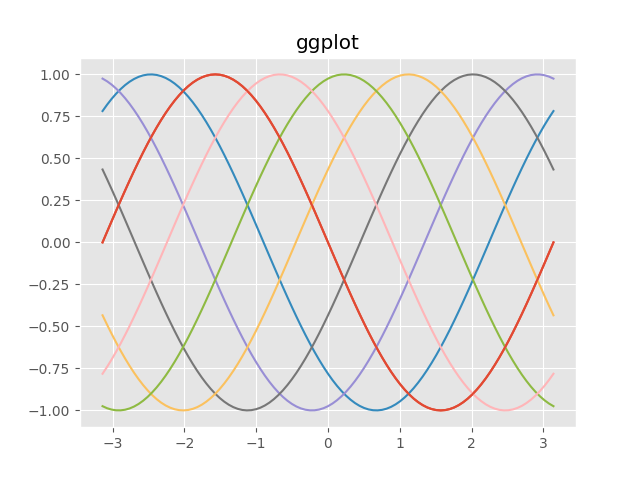
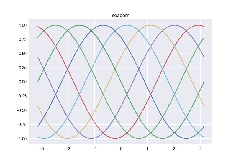
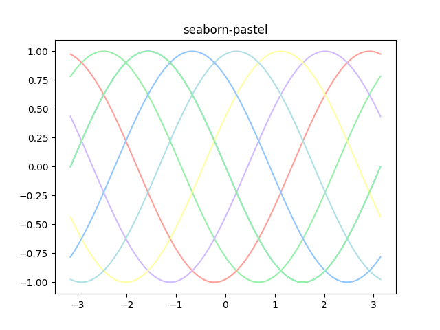
More styles:
Some nice tricks
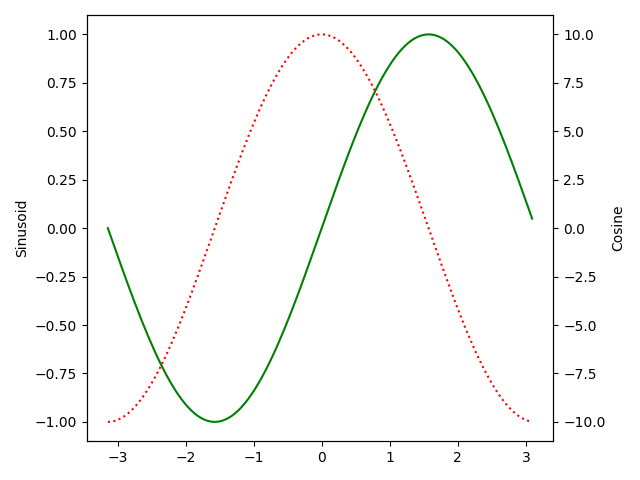
twinx()allows us to plot on a different y-scaletight_layout()rearranges plot elements so they fit nicely
import matplotlib.pyplot as plt
import numpy as np

t = np.arange(-np.pi, np.pi, np.pi/64.0)
x = np.sin(t)
y = 10*np.cos(t)

fig1 = plt.figure()
ax1 = fig1.add_subplot()
ax1.plot(t, x, 'g')
ax1.set_ylabel("Sinusoid")
ax2 = ax1.twinx()
ax2.plot(t, y, ':r')
ax2.set_ylabel("Cosine")
fig1.tight_layout()
plt.show()